
Clay & Bloom Pottery Brand Identity & Art Direction
Clay & Bloom is a handcrafted ceramics studio rooted in slow making and material honesty. The challenge was to translate this tactile, intimate process into a cohesive visual identity that feels both contemporary and deeply human.
CHALLENGE
To translate the quiet language of handmade ceramics into a brand that feels contemporary, restrained, and human—without losing its imperfection, warmth, or emotional weight.
The identity needed to hold contradiction: raw yet refined; simple yet expressive.
ROLE
Art Direction and Visual Design.
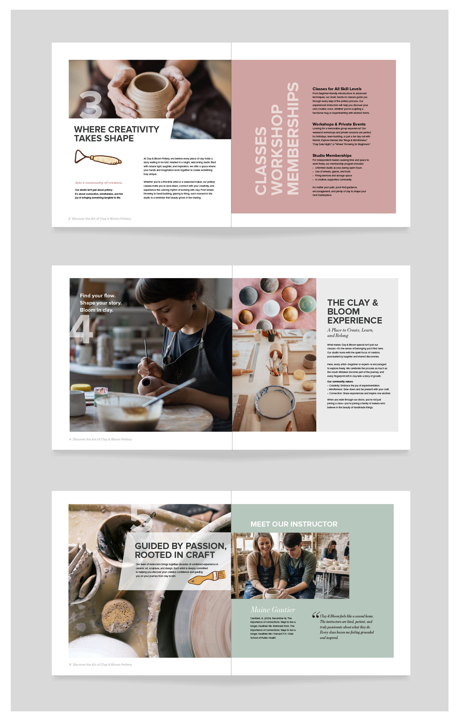
I led the creative direction, shaping the identity system from concept through execution, refining the visual language, logo system, typography, and photography direction across touchpoints.
APPROACH
The idea began with material truth: clay as transformation—earth, touch, fire, time.
This became the foundation for a visual system built on restraint and imperfection. Forms were kept subtle and organic. The logo carries slight irregularity, echoing hand-built gestures. Typography is quiet, giving space for texture to speak.
The palette is grounded in earth tones and kiln-washed surfaces, muted, natural, unforced.
Photography focuses on presence over perfection, light, shadow, surface, and pause. Each frame becomes a study of material and moment.
Every decision removed noise until only essence remained.
RESULT
A minimal, tactile identity system shaped by slowness and intention.
Clay & Bloom becomes a visual rhythm of material and breath, where craft is not shown, but felt.
A brand defined not by decoration, but by restraint.